

Separating fact from fiction: research from Agorapulse tells the real story of Facebook Organic Reach by Industry
Facebook reach is one of the most heavily discussed subjects in the Social Media Marketing ecosystem lately.
I first wrote about this topic in December, proving that, even if Organic Reach was down, it was not as bad as most people were making it out to be.
Buzz = buzz, not truth
The majority of negative content (and there’s been a lot) published on this hot topic, lacks sufficient data to back all the pessimism.
Recently, reputable brands such as Ogilvy have gone as far as announcing the “demise of Organic Reach” based on a study conducted on a sample of 106 brand pages. Yes, you read that right, the sample was limited to 106 pages (pages which don’t appear to be doing so well) among more than 50 million.
Finding significant data
Reach is not public data, and very few people (likely less than 20 companies across the globe) have the ability to access a significant number of pages’ reach metrics.
So most (if not all) of what you’ve read on the subject is probably irrelevant, or greatly exaggerated.
When it comes to commenting on Facebook Organic Reach, there are more “opinions” than hard data to back the assumptions. That’s a fundamental bias.
Big Data tells the real story
Thanks to the Agorapulse’s Facebook Page Barometer, we have access to metrics of more than 7,000 pages of all sizes, spanning all industries and regions.
We spent some time analyzing that data, and the results surprised us.
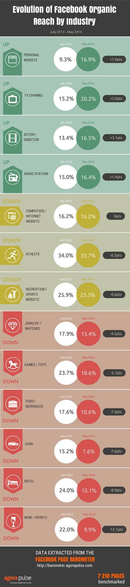
We analyzed the average post Organic Reach metric on an industry-by-industry basis in order to spot industries that were up, industries that were holding steady and those that have gone down.
Our goal here is to demonstrate Organic reach is not dismal for everyone. And even if it’s not for the majority of pages, there are still pages for which reach is going up or is steady.
There is a fairly large disparity among the millions of Facebook pages out there. Even if Facebook once announced that a Facebook page was reaching 16% of its fans, Some pages still manage to reach 40% of their fans with each individual post.
Should they kill their Facebook page? Hell no!
Keep in mind that sample size and averages are, by definition, just an indication. The reality is far more complex and diverse.
Here is the infographic with our results:
How was this data retrieved and computed?
This data was retrieved from Facebook Pages that have installed our Facebook page Barometer. We pulled an export in July 2013 and another in May 2014 to compare the evolution over that period of time.
- All data has been anonymized.
- All the pages with less than 100 fans have been removed, as these tend to have a pretty high organic reach and may have created an anomaly in overall averages.
- We then ran a macro in Excel to produce an average for each metric, by industry.
- Finally, we picked a sample of industries going up, down or remaining steady to produce the infographic.
Among the 142 industries (Facebook page categories) we have in the sample, only 18 are up or steady. But among the 124 categories seeing their organic reach going down, there are still a lot of them reaching more than 15 or 20% of their fans organically for each post.
No reason to throw the baby with the bath water yet…
As we want to be as transparent as possible with our data, we’re happy to provide you with the Excel file we’ve used with all our raw data. Just send us a message on our Facebook page with your request!
What makes our data reliable?
We focused on the Organic Reach metric for posts (the only one that cannot include paid reach) of over 6,000 pages. We then averaged Organic reach by industry and compared the results between the two periods (July 2013 & May 2014).
We removed anomalies– dismissing industries with less than 10 pages worth of access in July 2013 or May 2014.
Finally, we manually picked 4 industries with increasing reach, 6 with decreasing reach and 3 that were steady.
The pages in this sample willingly installed the Facebook page Barometer, which assumes that they were active enough to be interested in measuring their average performance.
Finally, as stated above, we are very transparent about our data and are eager to share it with you!
Is there any bias in our data?
Of course. As with any data sample, biases exist. First we manually picked the categories. Overall, there are much more industries going down than up.
Our goal was to analyze a wider spectrum and demonstrate that the situation is very different from one page (or one group of pages) to another.
As this is only a sample of 7,000 pages, it cannot be as accurate as a sampling including millions of pages. However, apart from Facebook, no one has access to millions of pages organic reach data. Our sample is one of the largest available.
As our average is based on the last 50 posts of each page, it’s possible that if a page has not published a post for a long period of time, its average may not be relevant to the concerned period. We’re assuming, however, that pages installing the Barometer are active.
Finally, we know that the size of a page impacts its potential reach in a major way. If an industry in our benchmark has a lot of pages with less than 3,000 fans, the average organic reach for that industry will be mathematically higher that another industry that has a lot of pages above 100k fans. We did perform a quick check of the average fan count for each industry we picked in order to make sure there wouldn’t be too great a bias.
For example, the “TV Channel” category which saw its Organic reach climb from 15 to 20% between July 2013 and May 2014 has 17 pages in the sample and their average fan count is 372k. So, it’s easy to tell page size is not creating any bias here!
How can you help make our data even more accurate?
If you think your page’s recent performance is not reflected by our data, this is the best way to correct it!


