

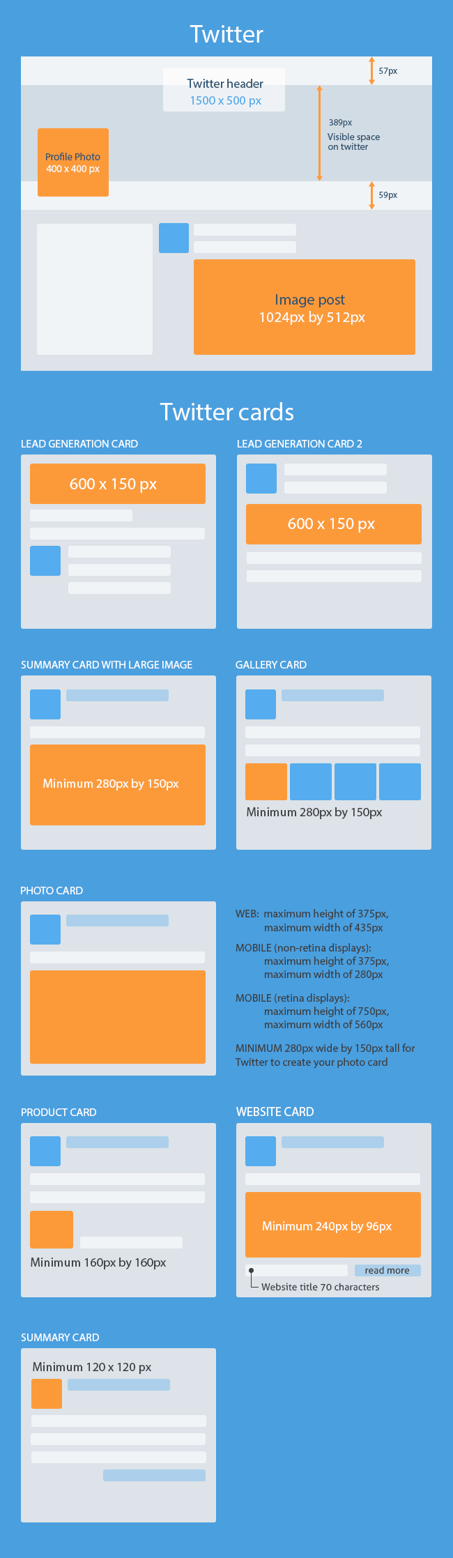
Twitter image dimensions span a wide range that marketers find impossible to remember. We created this guide to be a quick reference and included best marketing practices (based on a boatload of research) for each one so you can maximize the impact of your images.
We’ve pinned the infographic to the top of this guide so that you can easily refer to it. Feel free to bookmark it and refer back to it anytime!
[Updated on 28 December 2014: We received a few helpful suggestions that you’d like to see mobile dimensions marked out in the infographic as well. We’re working on it and will update this infographic as soon as we confirm those dimensions. Thank you and keep your suggestions coming in!]
Embed This Image On Your Site (copy code below):
<div style=”clear: both;”><a href=”https://www.agorapulse.com/blog/wp-content/uploads/sites/2/2015/01/Twitter-image-sizes-1.png”><img title=”All Twitter image sizes and best practices on how to use them” src=”https://www.agorapulse.com/blog/all-twitter-image-sizes-best-practices” alt=”” border=”0″ /></a></div>
<div>Courtesy of: <a href=”https://www.agorapulse.com”>Agorapulse</a></div>
If you want to see useful tips on how to use these dimensions, don’t stop reading.
There are currently 10 different image features:
-
- o
- Header
o
-
- Profile photo
o
-
- Image post
o
-
- Summary card
o
-
- Summary card with larger image
o
-
- Photo card
o
-
- Gallery card
o
-
- Product card
o
-
- Website card
o
- Lead generation card
1. Header
Recommended dimensions: 1500 px by 500 px
Aspect ratio: 3:1
Source: https://support.twitter.com/articles/127871-customizing-your-profile
Other guidelines:
-
- o
- Photos can be up to 2 MB*
o
-
- Accepted file formats: JPEG, JPG, PNG
o
- Rejected file formats: BMP, GIF, TIFF
* Refer to visual basic guide below
Headers have the largest real estate on Twitter, but they only come in handy when someone looks at your profile. Unlike Facebook metrics, Twitter doesn’t tell you how often your profile is viewed, so there’s no knowing whether Twitter headers are all that useful. But, since they’re the largest real estate on a profile, they make the greatest impact when someone visits. Let’s take a look at some good examples and what we can learn from them:
Don Schindler
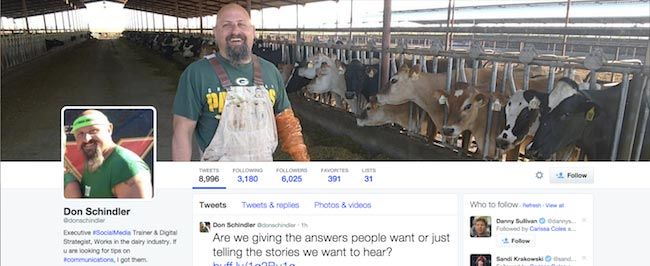
Don is a social media trainer and digital strategist in the dairy industry, and I’m pretty sure you aren’t surprised by what I just said. The header image on his Twitter profile says it all (almost). People interested in the dairy industry are bound to take a closer look at his tweets and bio once they see this.
Lifeoptimizer
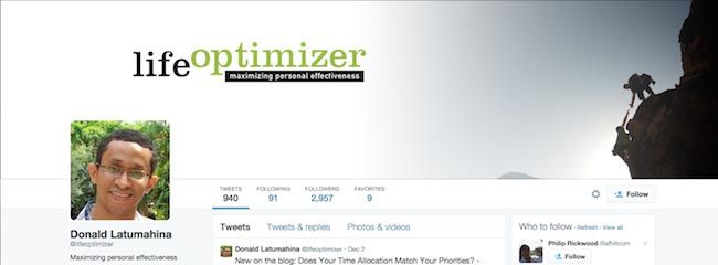
Here’s an easy way to tell people what your Twitter handle is all about – write your value proposition inside your header. Donald does a great job here by maximising personal effectiveness. He also made good use of ample white space to draw attention to his logo and tagline. Finally, you see an image on the right showing two people in a precarious environment. Put together, this brand message hits home.
And, plenty of other good examples… from Facebook!
When Twitter announced their profile redesign earlier this year the results were eerily similar to that of Facebook’s. While I didn’t like the idea of one social network copying another, this scenario does give us a lot of opportunities to adapt the same best practices of one to the other.
There are many ways you can make use of Twitter headers:
-
- o
- Personal branding
o
-
- Corporate branding
o
-
- Demonstration of product benefits
o
o
-
- Followers’ engagement through featuring user-generated content
o
-
- Support for campaigns
o
-
- Product promotion
o
-
- Followers’ promotion
o
-
- Putting employees under the spotlight
o
-
- Demonstration of social proof
o
-
- Sales
o
-
- Demonstration of support for a worthy cause
o
-
- Elevator pitch of your company or business
o
-
- Taking advantage of occasions to create opportunities for engagement
o
-
- Pre-launch teasers
o
-
- Demonstration of personality and freedom of expression
o
- Displaying testimonials
Head over here to see more header image best practices.
2. Profile photo
Recommended dimensions: 400 px by 400 px
Aspect ratio: 1:1
Source: https://support.twitter.com/articles/127871-customizing-your-profile
Other guidelines:
-
- o
- Photos can be up to 2 MB*
o
-
- Accepted file formats: JPEG, JPG, PNG
o
- Rejected file formats: BMP, GIF, TIFF
* Refer to visual basic guide below
Profile photos are rather straightforward and a lot less flamboyant than headers. In general, you should avoid using your company logo as your profile picture unless your company is well recognized. Follow these best practices to get your profile photo right:
-
- o
- Head shots work
o
-
- Casual or professional is fine as long as it is consistent with the image you portray
o
-
- No inappropriateness such as nudity
o
-
- Expression: Smile or frown if you will, as long as it reflects who you are
o
-
- No low resolutions: If your photo looks grainy at 400 px by 400 px, then you really need to pick something better
o
- No photoshop: Show who you are and what you look like, even if you put on makeup. Don’t make your cheeks slimmer, your chin thinner, your jaw line sharper or any other gimmicky stuff with photoshop. It makes you look insecure when people you know in real life see your profile picture.
3. Image post
Recommended dimensions: 1024 px by 512 px
Aspect ratio: 2:1
Source: https://support.twitter.com/articles/20156423-posting-photos-on-twitter
Other guidelines:
-
- o
- Photos can be up to 5 MB*
o
-
- Animated GIFs can be up to 3MB *
o
-
- Accepted file formats: GIF, JPEG, JPG, PNG
o
- Rejected file formats: BMP, TIFF
* Refer to visual basic guide below
Image posts on Twitter are like those on Facebook and they’re more impactful than text-only tweets because they take up more valuable real estate on the timeline, making them hard to miss. We recommend creating more image posts than text-only tweets for that reason.
You can also play around with creating interesting animated GIFs that aren’t allowed with headers and profile photos.
4. Summary card
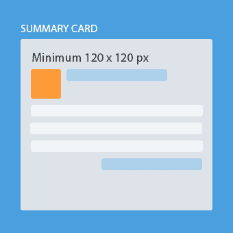
Recommended dimensions: 120 px by 120 px
Aspect ratio: 1:1
Source: https://dev.twitter.com/cards/types/summary
Other guidelines:
-
- o
- Photos can be up to 1 MB*
o
-
- Accepted file formats: JPEG, JPG, PNG
o
-
- Rejected file formats: BMP, GIF, TIFF
o
-
- For an expanded tweet and its detail page, the image will be cropped to a 4:3 aspect ratio and resized to be displayed at 120px by 90px
o
- For embedded tweets, the image will also be cropped and resized to 120px by 120px
* Refer to visual basic guide below
Summary cards are one of 9 different kind of cards you can find on Twitter. They’re used to give readers a preview of the content before clicking through to your website. Hence you can use them for anything from blog posts and news releases to products and store locations. Twitter suggests that you use a different image for each piece of content and strongly advises against using one general image across for all.
However, there is a better option with larger images which makes it more likely for users to notice your card on Twitter…
5. Summary card with large image
 Recommended dimensions: 280 px by 150 px
Aspect ratio: 1.867:1
Source: https://dev.twitter.com/cards/types/summary-large-image
Other guidelines:
-
- o
- Photos can be up to 1 MB*
o
-
- Accepted file formats: JPEG, JPG, PNG
o
- Rejected file formats: BMP, GIF, TIFF
* Refer to visual basic guide below
Frankly, I’ll never quite understand why Twitter offers the same thing with a smaller image. The summary card with large image gives your readers a rich photo experience and, if they click on the image, it will lead them to your website.
Although the recommended dimensions are 280 px by 150 px and files size limit is 1 MB, I recommend that you use an image with higher resolution but keep within 100 to 200 kB in size. Read the basic visual guide below to find out why.
6. Photo card
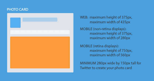 Recommended dimensions: 280 px by 150 px
Aspect ratio: NIL
Source: https://dev.twitter.com/cards/types/photo
According to Twitter, they will retain the original aspect ratio of your photo when resizing it to fit the following media:
-
- o
- Web: maximum height of 375px, maximum width of 435px
o
-
- Mobile (non-retina displays): maximum height of 375px, maximum width of 280px
o
- Mobile (retina displays): maximum height of 750px, maximum width of 560px
Other guidelines:
-
- o
- Photos can be up to 1 MB*
o
-
- Accepted file formats: JPEG, JPG, PNG
o
- Rejected file formats: BMP, GIF, TIFF
* Refer to visual basic guide below
These recommended dimensions (280 px by 150 px) are the minimum requirement Twitter has imposed for photo cards. The photo card puts your image at the center of the tweet. Clicking on it will lead to a larger and more detailed view, just like the popup photo view on Facebook.
Since Twitter is flexible when it comes to the aspect ratio of your photo, you can simply make use of the same photo that you use in your blog post, website, or another social media platform.
7. Gallery card
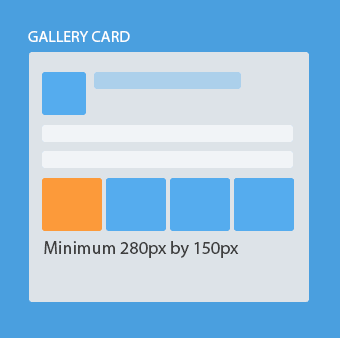 Recommended dimensions: 800 px by 800 px
Aspect ratio: 1:1
Source: https://twittercommunity.com/t/gallery-card-dimensions-aspect-ratio/16389/3
Other guidelines:
-
- o
- Similar to previous guidelines, each photo can only be up to 1 MB*
o
-
- Accepted file formats: JPEG, JPG, PNG
o
- Rejected file formats: BMP, GIF, TIFF
* Refer to visual basic guide below
The recommended dimensions of 800 px by 800 px is an unofficial recommendation from a Twitter staff member. We had to dig through a thread in Twitter’s Help section to find it.
As you can see, gallery cards appear the same way Facebook posts look when you upload multiple photos or an album. They are helpful in showing that there is more than just one image in the URL you’ve shared, but they have less of a visual impact since multiple images appear smaller.
8. Product card
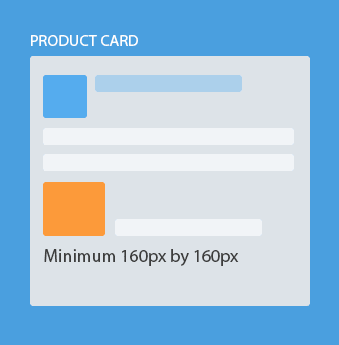 Recommended dimensions: 160 px by 160 px
Aspect ratio: 1:1
Source: https://dev.twitter.com/cards/types/product
Other guidelines
-
- o
- Similar to previous guidelines, each photo can only be up to 1 MB*
o
-
- Accepted file formats: JPEG, JPG, PNG
o
- Rejected file formats: BMP, GIF, TIFF
* Refer to visual basic guide below
Like the photo card, the recommended dimensions of 160 px by 160 px is the minimum requirement that Twitter imposes for product cards. Product cards can automatically fetch your image from your URL. They’re a great way to represent products and retail items, making them a great addition to any e-commerce business’ content strategy. It also allows you to highlight two key features about your product in the description.
9. Website card
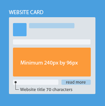 Recommended dimensions: 240 px by 96 px
Aspect ratio: 5:2
Source: https://blog.twitter.com/2014/increase-traffic-and-conversions-with-the-new-website-card
In the website preview, an image, title, short description and call-to-action button will be presented to your target audience. This card is only available to advertisers.
Twitter recommends you combine the use of website cards and their advanced targeting options such as interests, keywords, and tailored audiences to maximise the likelihood of generating relevant click-throughs to your website.
10. Lead generation card
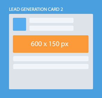 Recommended dimensions: 600 px by 150 px
Aspect ratio: 4:1
Source: https://support.twitter.com/groups/58-advertising/topics/260-promoted-tweets/articles/20170770-setting-up-lead-generation-cards
Other guidelines:
-
- o
- Minimum required width is 600px
o
-
- Maximum image size of 1 MB*
o
- Supported file types are: GIF, JPEG, JPG, PNG
* Refer to visual basic guide below
You can choose between downloading the leads or uploading them automatically to your CRM database by setting up the endpoint.
Like the website card, the lead generation card is available only to advertisers. Third party Twitter CRM tools are available to all.
The basic yet important social media visual content guide
1. Use appropriate colors that maximise impact
There are two aspects of colors you should take note of when choosing an image or graphic.
First, you need to understand color psychology and how it impacts purchases as well as consumer behaviour. Ideally, you should be using a color that enhances your brand’s image and the feelings you’re trying to convey to your target audience.
Second, avoid visual conflicts. Make use of tools like this to pick appropriate colors that match one another. While the average person may not be able to tell you what’s wrong with an image, we’re all capable of discerning attractive from unattractive.
2. Use human faces in your image
Luke suggests that you make use of neutral faces to create intrigue and ambiguity and lure the viewer to think about what you’re trying to convey.
Of course, this isn’t a one-size-fits-all solution so you’ve got to make an contextual judgment. You’ll likely want to make use of neutral expressions if you’re promoting or using:
-
- o
- Luxury brands
o
-
- Beauty products
o
-
- Poker
o
3. Use PNG over JPG or JPEG
This advice comes from our experience with social media images, and we’ve got a lot of that! Whether you’re uploading an image to Twitter, Facebook, or Pinterest, we find that images in the PNG format retain their quality best when compressed.
If this hasn’t been the case for you, please tell us about it below.
4. Bigger isn’t always better
Donna Moritz, a social media visual content expert, recommends social media marketers to think about how and when their social media posts are likely to be consumed.
According to Statista, 85% of Twitter usage in the United States is on mobile devices.
If your target audiences are in the United States, then you’ll want to optimise your posts for mobile consumption.
Furthermore, if they’re more likely to use Twitter on the move rather than at home or in the workplace, they’re likely to be using 3/4G connections instead of WIFI. This means that your images should not be too big (100-300kb for a reasonable quality) as they’ll take too much time to load.
You could also consider creating Twitter ads separately, uploading one with higher resolution (and thus smaller file size) for desktop and a lower resolution for mobile, and third party Twitter Management and CRM tools.
Once you feel good about your Twitter images, it’s time to focus on the rest of your tweets. Agorapulse helps you schedule tweets, monitor activity and hashtags, and share your results in gorgeous, downloadable Twitter reports.
(Want to try Agorapulse? Sign up for a free trial!)
Your turn
To make it easier for you, we’ve combined all of the dimensions into a neat infographic that you can see at the top of this post!
If you find this guide useful, please BOOKMARK and share it with your colleagues and friends! If you spot anything that is wrong or outdated, let us know in the comments below and we’ll update it and credit you accordingly. If you have other basic visual content tips to share, we’d love to hear them!


